Find out why you should apply responsive design to your website and improve its interaction with different types of mobile devices.
Is your site adapted to be viewed on all types of devices? Do you have visitors who connect both by computer and by cell phone or tablet? What if we told you that this condition is not so new, would you pay more attention to it?
In this post, we will explore some basic questions about adaptive web design and show some advantages that it brings in terms of performance and results.
These are the questions we will answer throughout the post:
- What is a responsive design website?
- Why do you need a website with responsive design?
- How can a responsive website help your business?
- What can happen if you don’t adapt?
Introduction: Beyond the Desktop
Are you reading this post on a computer, tablet or cell phone? That’s not a random question. It is only being asked because the way to surf the Internet is becoming more and more diversified, and any of those options is possible.
It’s been a while since people stopped saying “I’m going to get on the Internet”. You just have to take your cell phone, connect and go. Without any difficulty, we are online.
Look around you, in your office, at the bus stop, at the mall’s food court, at the beach, at the cafe and even in traffic. Someone is with a cell phone in their hand, right? It’s such a common behavior that not thinking about how it can influence your business is falling behind.
Also, one detail should be taken into account. Most of these people are browsing applications or sites adapted for mobile devices. That fact turns on the warning light: we have to make our business available to users as well. Otherwise, the possibility of them leaving our site, due to a bad experience, and going to a competing site, is enormous.
This is where the advantages of a site with responsive design come in.
What is a responsive design site?
Do you know of a place that you can access by cell phone that uses letters so small that you have to zoom in to read? That site lacks responsive design.
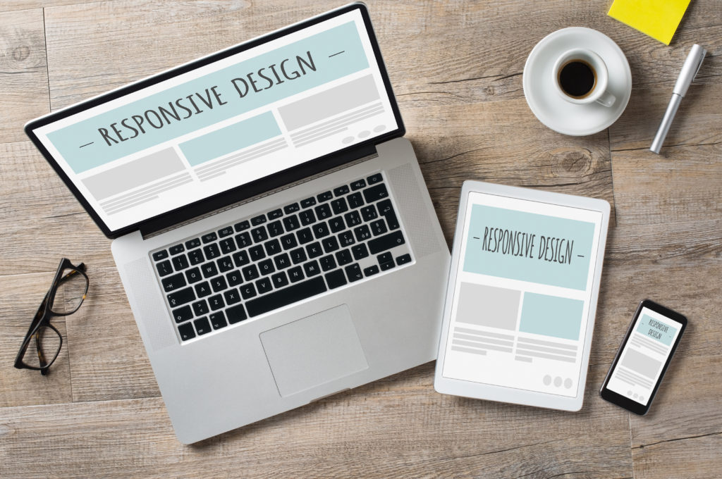
Adaptive websites are intelligently designed to fit any resolution, without distortion. An adaptive website identifies what the width of each device is, and thus is able to determine how much space is available and how the page will be displayed to make the most of that space. It also adjusts the dimensions of the images, fonts and other elements on the page so that they are not disproportionate.
In very practical terms, they are those sites that, with the same layout, adjust perfectly to any resolution in a harmonic way, passing the same reading experience to the user, regardless of the device through which he is accessing.
There is a common confusion between sites with responsive design and mobile versions of a site. There are some differences between those two features, as we will see below.
Differences between a responsive design site and a mobile version
A site with responsive design is any site created to fit any type of screen. It is a single structure of code that works in different resolutions.
A mobile version is a little different, it is a second, separate site, made exclusively to be accessed on certain types of devices.
It is recommended, for several reasons that you will see below, that the site has a responsive design. However, if it is not yet possible or if you have a project underway for such an adaptation, a mobile version or a plugin that adapts to mobile devices is also an interesting option.
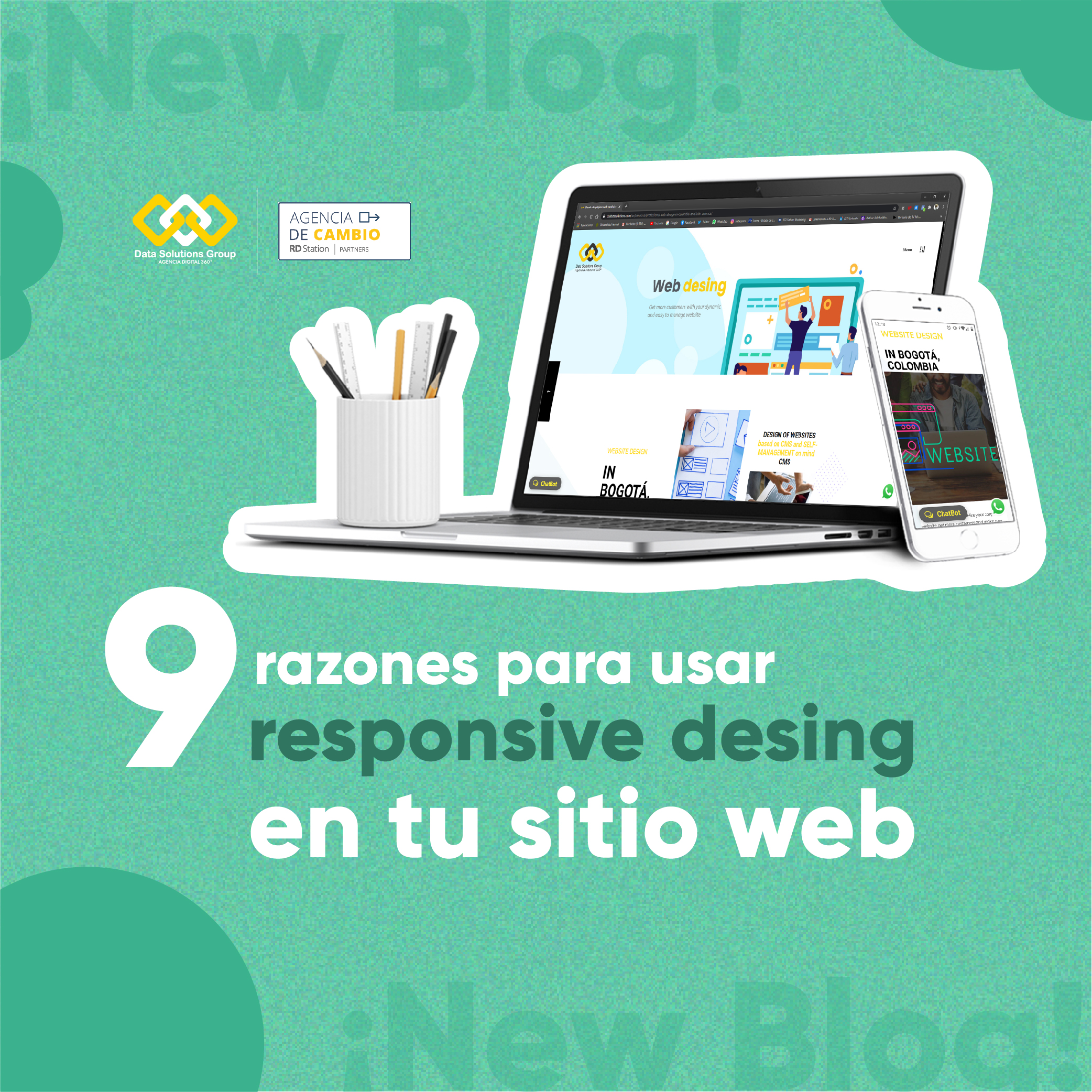
9 reasons to have a site with responsive design (and its advantages!)
Now that you’re in context and have understood what a responsive design site is, it’s time to talk about some reasons for you to use this resource on your site.
1 – Improve the user experience
User experience is everything. And it brings concrete results.
According to Google Think Insights, if a user accesses your page through a mobile device and doesn’t find what they are looking for, there is a 61% chance that they will give up and go elsewhere.
On the other hand, if they are satisfied with your site, if they have a positive experience, the chance that they will convert to your product or service is 67%.
Take yourself as an example. Every time you open a website on your cell phone and realize that it is misaligned, are you dissatisfied?
2 – Mobile access is growing (and should continue to grow)
A giant survey conducted in 63 countries by Google Consumer Barometer, including Spanish-speaking countries in the Americas, found that last year more than 50% of the population connected to the Internet did so through their mobile devices.
The use of mobile Internet at a global level today reaches 76%, with percentages that in individual markets vary from 71% in Mexico to 86% in Argentina. The trend is for these numbers to continue to rise, thanks to advances in the development of mobile devices and bandwidth quality.
3 – SEO + Mobilegeddon
Google favors sites with responsive design and, above all, when the search is performed by mobile devices, it gives them preference, naturally increasing organic traffic.
Therefore, having a site with these characteristics contributes to appear in the search results, independently of the device that the user is using to make that search.
One of Google’s updates in 2015 received the affectionate nickname of Mobilegeddon (Mobile + Armageddon). Google’s intention is to favor sites with responsive design or a mobile version over those that are unprepared.
In addition, the URL structure will remain the same on all devices, which also improves your ranking and your site’s visibility to the search engine.
4 – Increase page speed
One of Google PageSpeed Developers’ recommendations is that content above the display on a mobile device should load in less than 1 second. And that the complete loading of the page takes less than 2 seconds.
In most cases, this becomes unfeasible when a desktop version of the site loads on a mobile device. The loading speed, besides being a ranking factor for Google, also hurts the user. If the site takes a long time to load, there is a high probability that the user will close the window and look elsewhere for what they need.
A site with responsive design is already lighter and optimized for mobile devices and therefore loads faster than a desktop version.
5 – Decrease the bounce rate
Having a site with these features reduces the number of users who access and leave without any interaction.
This item is connected to the user’s experience, since if it is not well received when they enter the page, the chances of them closing and quitting – or going on to another search – are great.
It is important to be careful with this bounce rate, since if it is very high, it can be interpreted by Google as a sign that the content is not relevant. And when that happens, the possibility of your page losing positions is high.
6 – Increase sales
According to Criteo’s “Global Commerce Review” report, by the third quarter of 2017, 44% of online purchases in Latin America were made through mobile devices.
In that aspect, the preference of the population still remains the desktop, which has for the same aspect a rate of 56%.
However, the numbers show a trend that is in full development. Having an application or an adaptable website for an ecommerce, for example, is a way to increase your sales.
7 – Increase the Leads Conversion Rate
Just as there is an increase in sales, there is also the possibility of increasing conversion and generating leads through mobile devices.
If you use social media to promote your materials, you need to have responsive design. The user may be surfing the networks on their smartphone when they see your link on the news feed. And if, when they click, the page is misaligned, there is a much greater chance that it will not convert to opening the link again on the desktop.
8 – Better dissemination on social networks
In Latin America, according to several studies, 88% of Internet users use social networks every day. As access to social networks through cell phones and tablets is becoming more frequent, it is ideal to have a site with responsive design. The opportunity for your page to be shared in social networks by those users is much greater if they have a pleasant browsing experience.
In addition, having a single page with responsive design makes the experience more enjoyable for those who access a link that was shared via cell phone. This prevents a mobile version – usually well summarized – from opening on a desktop, such as those domains, for example, “http://m.site.com/slug-da-pagina”, or “http://site.com/mobile/slug-da-pagina”.
9 – Prepare for future devices
One of the biggest advantages of such a design is that it is made for different resolutions and not for different devices. That is, no matter what the screen resolution of the device your visitor is using, the layout will adapt.
This opens a gap for future devices, which can be launched with different resolutions. A responsive design leaves your site ready for any device, even those that don’t yet exist.
Conclusion
The mobile devices are already here and they are going to stay. It is no longer the future, it is the present. After all, it’s also not absurd that some people no longer use the Internet through computers. Nor is it absurd that some people don’t even have computers at home. Today, most templates are already produced with an adaptive web design in mind. That’s why I ask you: How is the design of your site? Is it adaptable? Does it have a mobile version? Does it use a plugin? Or are you still implementing a new version?